
Design system
Increasing consistency and turnaround time by 80% with an in-house design system

ROLE
Product Designer
TIMELINE
6 Months
TEAM
3 Product Designers, 1 Visual Designer 1 Product Managers
OVERVIEW

What is UnDosTres ?
UnDosTres is a Mexican super-app for everyday transactions like mobile recharges, bill payments, streaming, cinema tickets, bus bookings, and more.
My Role
I joined the team as a Product Designer in March 2022, even before getting my undergrad degree.
Few weeks in I realised there is a desperate need for a design system.
What started as my observation turned into a pitch, and eventually into one of the most impactful projects I worked on i.e. a design system built from scratch that changed how the entire team designed and shipped.
Oppurtunity
The opportunity emerged during a planned frontend codebase shift from React to Flutter.
At the same time, ongoing user feedback and internal reviews highlighted gaps in the product experience inconsistencies, outdated UI patterns, and friction across key flows. Instead of treating this as a technical migration alone, we saw it as a moment to rethink the product experience more holistically.
Problem
Why we needed a design system ?
No single source of truth between design and development.
Designs were inconsistent across flows, components were recreated repeatedly, and there was
It degraded UX and slowed down design and delivery.
I documented these inconsistencies, putting examples side by side to make the problem visible and hard to ignore. Rather than pitching it myself to leadership, I brought senior stakeholders into the conversation early, knowing that buy-in from the top would move things faster than a bottom-up push alone. It worked.
Sprint Plan
Instead of directly designing screens, we first aligned on how we wanted to build. At the same time, we mapped our work into sprints so redesign and system building could move together, not separately.


We chose Atomic design because it closely aligned with flutter's ideology
We defined a structure for the design system, agreed on naming conventions, and planned how it would integrate with frontend development.
・Atoms →Icons, buttons, inputs | atoms/icon/home/recharge
・Molecules → Grouped UI elements | molecules/input/phone-number
・Organisms → Reusable product sections | organisms/card/home/recharge-services
Created predictable hierarchy
Simplified component discovery
Reduced duplication
Aligned with Dev Structure

Research
The opportunity emerged during a planned frontend codebase shift from React to Flutter.
To understand how is the current experience and pain point with the product, we decided to perform a thorough market research. Our research combined a
lightweight product audit,
stakeholder interviews,
developer conversations
customer feedback gathered through user interviews and community events.
We also reviewed leading products in the region, including Mercado Libre, Rappi, and PayPal, to benchmark experience standards.
Across interviews and audits, a common theme emerged: the platform was highly functional, but the experience felt inconsistent. Repeated patterns appeared in areas such as navigation, profiles, and payments, where users encountered varying interaction styles and visual treatments.
These findings provided a clear picture of the experience gaps that had accumulated over time and highlighted opportunities for improvement.
execution
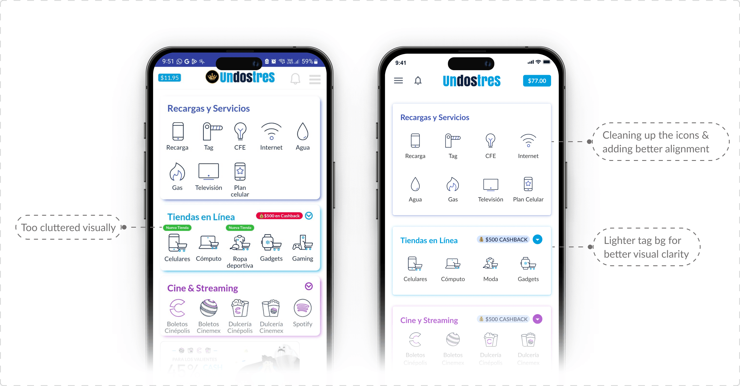
We began by building the base layer — the UI kit.
Typography, colors, spacing, and core components like buttons and inputs were defined first. These weren’t just visual decisions, but building blocks for everything that followed. This gave us a starting point to design with consistency.

The work didn’t happen in waterfall method, instead we sprinted together.
Each designer picked key flows and started redesigning them using the system. At the same time, new components were created, refined, and added back into the library. The system wasn’t built first and used later, it grew alongside the product.
I personally owned and redesigned four major flows: Home, Onboarding, Payment/Checkout, and My Profile. So not only did I conduct researches to optimize these flows, but also took care of building and pushing the components to the system
The homepage flow was more inclined towards working around the visuals and shipping better components without changing the structure or the brand identity, as it was a pretty functional and well-to-do page ( information from the user + stakeholder information)
I had regular syncs with the product and dev team, shared components early, and aligned on how things would be implemented.
Hence, handoffs happened in cycles, not at the end. This reduced back-and-forth and helped both teams stay in sync.
The profile page redesign was very interesting as I had a lot to work with. I utilised it as an opportunity to fix the navigation of the app, and cluster actions for better flow.

Hand-off happens with proper developer notes

The Payment flow was the challenging and the most important one. I learned a lot during my initial ideation and research phase, talking with the team, how spanish users interact and how to think around the business.


Hiccups - Too immersed in components, skipped the point of making it Responsive
Midway through, we realised we had gotten so deep into building components that we had skipped a critical consideration: responsiveness. We caught it during a dev handoff review, paused, went back, and revised the affected components before they were implemented. It added time in the short term but saved significantly more pain later.
impact
From 7 days to 2–3 days
Before the design system, delivering a new feature design took around 7 days on average
After the system was in place, the same work took 2–3 days. That's roughly an 80% reduction in turnaround time.
Another example that proved the design system as a success was shipping the OXO bus booking feature in 5 days
The clearest demonstration of the system's impact came when OXO became a partner and we needed to design an entire bus booking flow inside the UnDosTres app. End-to-end, new flow, new patterns.
Six months earlier, a project like that would have taken at least 20 days. With the design system in place, the team shipped it in 5 days.
What trade-offs did we do ?
We held back more radical experimental layouts and focused only on what could realistically be built within Flutter's constraints at that stage of migration. The bigger swings were parked for later.
We made a conscious call to deprioritize the web app entirely. With over 90% of users on mobile, it was the right focus but it's scope we knew we were leaving on the table.
Looking back, I would rebuild the foundation with tokens and AI-assisted design tooling available today which would have made component generation and documentation faster and more scalable.

