top of page


Experience Revamp of Scan2go app
TIMELINE
Aug, 2021 - Oct, 2021
MY ROLE
UI/UX Designer
BUILT ON
Figma
Introduction
Introduction
Scan2Go is an application to make in-restaurant food ordering more contactless. The product has two versions.
-
App - It is for the restaurant employees to track and manage orders, update the menu and inform their customers about the food status
-
WebApp - It is for the customers of the particular restaurant, where they can get the menu after scanning the QR and order food online.
I worked on redesigning the mobile application and creating a brand identity for Scan2Go.
Users

RESTAURANT EMPLOYEES
The waiters, managers, and chefs are going to use it to track all the orders they have received, update the menu, and inform customers about the food's status.
Research
USER INTERVIEWS
To redesign and improve the user experience, it was very important for me to understand what problems the users were facing while using the app for the past two months in their day-to-day life.
I recruited five employees from different restaurants in charge of the app and interviewed them virtually.
-
First, I asked them a few questions to understand their feelings about the app, pain points, and frustrations.
-
Then I asked them to complete a few tasks in the app to catch the points where they were facing friction.
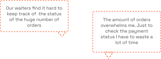
Some common complaints that most of the employees had about the app-
SURVEY
After gathering insights from the interview, I shared a small survey form with all the employees of all the restaurants we were partnered with to validate the insights I gathered.

70%
Found it difficult to keep track of order status
56%
Found it hard to check the payment status


41%
Found it time-consuming to manage the Menu
App critique
I collaborated with the Product and the tech team for this activity. The reason why I included the tech team was to understand their thought process while designing and building the 1st version of the app.

Problems


Undefined Workflows
The buttons and CTAs are scattered and placed in an unorganized way.

Clutter of Data
All types of order data was getting cluttered in the same page and there is no way to sort and filter the different types of data.
No Brand Identity
-
There was no defined color or text style.
-
No specific brand identity was defined.
Problems
“ How might we redesign a better experience for the cafes to manage their customer efficiently ”
Goals
After analyzing all the insights that I gained through user research and understanding the vision of the Product, I defined the goals that I needed to achieve through this revamp
1. To improve the User interface.
2. Optimise user flow for all the Job stories.
3. Reduce the Turn-around time.
4. Manage the excess customer data generated regularly.
Impact
80%
Reduction in the Turn-around time.

4x
Faster increase in clients.
Process

User flow
AI mapped the new user flow based on the research insights

Wireframing
I created low-fidelity wireframes and reviewed them with the Tech team to get their feedback and understand all the engineering constraints.
Defining the UI

While working on the wireframes, I was also trying to define the brand colors. After a few iterations, I decided to go with this warm gradient, which signifies the richness of foods perfectly.
Also, I created the components for all the needed elements, so that maintenance of the design files become izzy pizzy
Final Designs
After 3-4 iterations for each screen, I have finalized the designs for Scan2Go V.2. Below; I will be showing you the previous designs and how I redesigned it
Onboarding Screens
no onboarding
unaligned placments of elemets


unhide option
absent
OLD DESIGNS - The UI looks cluttered and no branding work is visible.

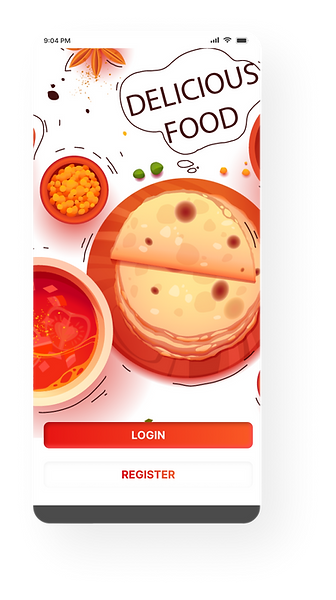

NEW DESIGNS - I believe a good onboarding with proper brand logo and graphics is just like a warm welcome to the users, and they also allow us to create a good first impression.
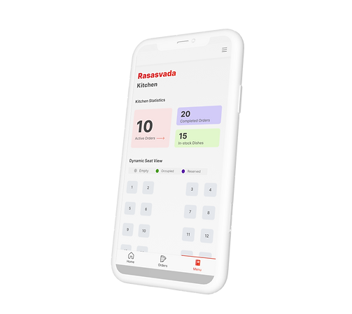
Home Tab
All the CTAs are randomly placed
OLD DESIGNS - I could notice the lack of UX thinking in the design architecture of the Home tab and I saw a lot of scope for improvements.


NEW DESIGNS - Scan2go wanted to introduce a new feature of dynamic seat arrangement, and I had the pleasure of designing it with a minimal and clean approach, And I grouped all the scattered buttons and placed it inside the hamburger menu, because that is the common solution we can see across all the apps and as per Jacob's law users spend more time using other apps and they expect our app to function the same way.
Orders Tab
Large amount of unsorted data
Information clutter inside the card
OLD DESIGNS - This tab receives an overwhelming amount of data because for each new order placed a card is created and without any option to filter these data, employees managing orders through the app feel a bit overwhelmed.
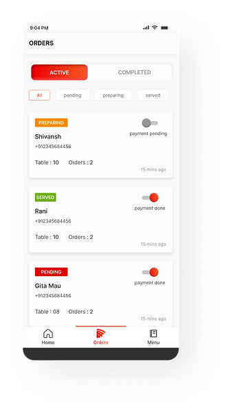
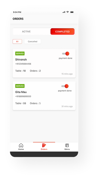
NEW DESIGNS - To tackle a large amount of unsorted data, I introduced 2 new features. First, I used a tab to differentiate active orders from Inactive orders. Next, I used filter chips to tackle different orders based on their status. Once the order is served and the payment is completed, the card automatically moves to the Completed tab.


NEW DESIGNS - The ORDER DETAILS page is pretty straightforward and clean, I have used the space to mention the Tbale number and the amount. The controls to update food status is given to the users.
Menu Tab
Information clutter inside the card
Unsorted data
OLD DESIGNS - This tab had a very similar issue to the order tab. A lot of unsorted cluttered data
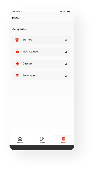

NEW DESIGNS - I decided to divide the menu into different food categories instead of showing all the menu items randomly on one screen. The best solution would have been using a SEARCH BAR, but due to engineering constraints, we could not move forward with it. Cleaning the card and improving the UI was the next thing that I targeted for this tab.
Future
-
Improving the features like adding a search bar etc.
-
Maintain and update the user experience with time.
-
Fix bugs and optimize with regular user testing.

.png)
bottom of page