top of page


Designing PrepEasy from Scratch
TIMELINE
Nov, 2021 - Jan, 2022
MY ROLE
Freelance UI/UX Designer
BUILT ON
Figma
Introduction
PrepEasy is an ed-tech platform that helps students prepare for the JNV entrance exam. Here students can learn from recorded video tutorials, ask doubts to the mentors even give mock tests.
Also, weekly live classes are conducted to help them learn better.
In this project, my role was to understand the vision of the founders and design the MVP for the mobile app, single-handedly
Problem

-
In this era of booming Edtech and digitalization, JNVST, an entrance exam with 25L+ yearly applicants ( Almost up to the total applicants for JEE and NEET ), doesn't have any dedicated platform for the preparation and hence many students don't have access to proper guidance at an affordable rate.
-
With the onset of COVID-19, the students from rural areas (which is more than 50% of the total students appearing for JNVST) were affected the most as traditional classrooms were closed, and they desperately needed easy access to trusted Teachers and structured study materials in their native languages.
Our Users

PRIMARY USERS
Students from classes 5 and 6 preparing for the JNV entrance exam
SECONDARY USERS
Parents of these students. They will be the Point of contact with whom all the important info and they will also be helping their kids get accustomed to the app

Teachers who will be preparing the kids for their exams will also be using the app, but separate views for them are not considered in the MVP.
Design Framework

I decided to use the DESIGN THINKING FRAMEWORK for this project as I was building it from 0 to 1.
Research
For starters, I had a collaborative meeting with all the 3 co-founders of Prepeasy to understand why they chose this particular problem statement for their startup.
While talking to them I realized that, for the 3 months they have advanced a lot in the research part for the product and have even done idea validation by conducting surveys and interviews.
For the next 2 days, I went through all of the research documentation and was really happy with the advancement.
But I conducted 2 more research to get absolute clarity on the design goals for this project
CONDUCTING INTERVIEWS
to understand the mindset of the students I interviewed
- 2 of the students studying in class 5.
- Vishal Sir, has been tutoring students in rural areas for the JNV exam for the past 5 years.
- 1 student who has appeared and cleared the JNV exam in the past.
COMPETITIVE ANALYSIS
This step helped me gain insights into how other apps in the market are designed, which features work for them, and which are against them.
Some of the apps that I referred to are -
- ByJu's ( They started spam calling me after I registered to their app😅)
- Vedantu
- Toppr
Goals
I had gathered a lot of data from all the research and analysed them to define the goals clearly
The app should be easy to navigate
Since we are dealing with children and a big chunk of them also belong to rural areas, complex user-flows can lead to frustration and dropouts
The UI should be fun, colorful & intuitive
Children can get easily bored, so creating a fun UI can help us grab their attention.
The app should be very interactive.
Preparing from home can get lonely, and the growth that happens while interacting with other students and listening to their doubts should not be compromised.
User Flow

After gathering all the insights, I, along with the other co-founders, brainstormed on feature prioritization for the MVP.
And after that I created the user flow for the app
Job Stories

Job stories help me to keep in mind all the use cases that I need to solve. And all the edge cases are also covered while doing this activity.
To make it more accurate, I requested one founder, who was leading the product part, to contribute to this file.
Wireframing

Then I started making low-fidelity wireframes and kept the co-founders in the loop so that they can keep giving me feedback on the designs.
Early Iterations
Here is a sneak peek into my early iterations of the app, where I was trying to figure out which color palette, mascot, typography, etc., defined the brand perfectly.
Once the brand color and style were decided, each screen got finalized in 2-3 iterations.

User Testing
I conducted 2 rounds of user testing over the period of 3 months. After completing the first iteration of the app, I decided to test it with 2 children from Class 5.
For the 2nd round of user testing, I recruited 2 children and 1 parent.
-
I followed a simple process i.e. allowed the child to freely interact
with the app & records their behavior. -
Followed it with a few questions about the app.
-
Asked them to perform a few task in the app.
-
And wrap it up with their feedback.
The reason behind testing it at a very early stage was to get validation if I was moving in the correct direction or not, and also to see the first reaction of these children to the UI of the app. I conducted the test in person, & used a prototype in the Figma mirror.
Final Designs
Here's a detailed walkthrough of the PrepEasy.
Onboarding


So, right after the splash screen, users will get the option to select the language they are comfortable with. And then, they arrive at the signup screen, which has a fun and playful tone. The signup process is very simple and only requires your phone number, as I did not want the kids to get overwhelmed with multiple signup options.
Home Tab where you can get a quick overview of everything happening in the app
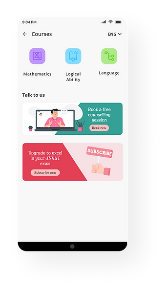
Easy access to explore all the courses
Informative general videos on JNVST

Convinient way to change the language
CTA to talk to the team to know more about the course. I kept it up front as this will help increase student conversion rates
To decide the information hierarchy of the Home tab, I conducted a card-sorting activity with the Co-founders ( to consider the business perspective and with 5 students and 2 parents to understand user needs.
Detailed and structured courses, to learn in a flow
clean categorization
using blank space for banners

Using graphics and detailed title to give a overview of the lessons.
Here I have organized all the lessons in a structured manner and even added a summary of the content in a card above
Calender to keep track of live classes schedules and attend them easily


This page has all the information about the live classes, both Ongoing and Upcoming. To attend an upcoming class, I have even provided a feature to set reminders that will send a notification 30 mins prior to the session beginning.
Doubt forum is the tab for interaction and even helps you learn from others


This is my favorite tab. Here not only users can ask their doubts but even learn from others' doubts, allowing them to grow holistically. And even a child can help others if they know the answers. It also allows users to save the questions and answer and create notes for revision.
As there will be a lot of doubts, I have decided to add a search bar and even a filter to allow users to easily analyze data without getting overwhelmed.
Learnings
This project taught me a lot and I will love to share some of my learnings here-
Designers are not the real users
Since we are In my first iteration, I created a lot of interactions based on my assumptions. And to my surprise, when I did the 1st usability test, many assumptions failed. That was the point I realized the importance of conducting research and user testing with real users
Always keep the business goals and engineering constraints in mind
Now, we all love fancy designs, but as a designer, it is also our responsibility to know the current capacity of the startup and keep the tech team in the loop with your designs.

.png)
bottom of page